Magazine Cover Design


Wednesday 4th may 2022
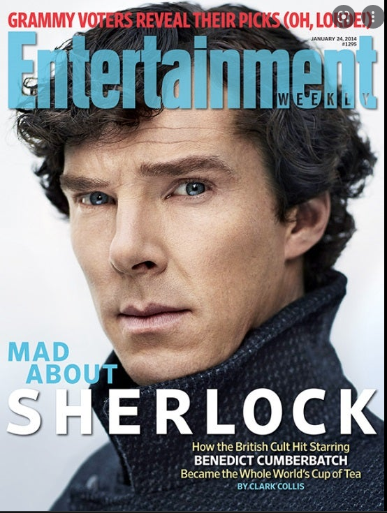


The things that they have in common are they are quite natural colours but they all stand out, they also have the main image which is similar to each other.
.They have datelines
.They have cover lines
.They have masthead
.They have institutions
.They have Main Images
Music Magazine covers for pop

masthead- title
The masthead are mainly in the front but there is only one that is behind her
They are bold colours and they stand out
Wednesday 11th May
L:o- Explore the use of adobe illustrator to create a magazine masthead
Wednesday 18th May
L:o- To use Adobe illustrator to create an effective magazine masthead
The genre i am doing is music and the sub-genre im doing is pop
My title of my magazine is The story of music
The conventions i am using are a set of colours which will be yellow, blue and pink and possibly red. I would be using the writing at the start for example, 'The story' would be bold and colourful (well some of the letters) and then the rest of the title 'of music' would be big but not as big as 'The story'.
i like my 1st one better because it has more detail than my 2nd one
for my 2nd i still need to add the 3rd outline and add a bit more detail such as colour and shapes

Comments
Post a Comment