Coursework
Wednesday 10th May
L:O- To research codes and conventions of similar products
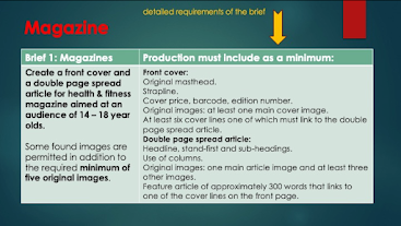
Create a front cover and a double-page spread article for health and fitness, the magazine needs to be aimed at 14-18 year olds.
Task 1:
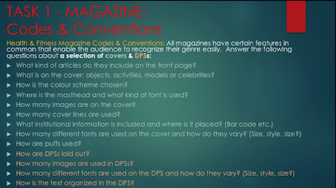
1. On the front page of the exam they include motivational sentences
2. On the cover there are models and objects
3. The colour scheme is colours that will attract teenagers to the magazine example: Red and blue
4. The Masthead is above the models body and the font is Isidore Sans
5. There is one image on the cover but with that there is some objects that are being used in the photo
6. The cover lines are motivational sentences and there are also tips for beginners
7. The barcode is placed on the right side at the bottom of the page
8. There are 4 different fonts on the cover and at the top of the cover it goes from big medium and then small
9. They are laid out so the model is empathised but the text is also noticeable
10. 2
11. 4
12. The text is spread out
L:O- To analysis magazine in detail
Magazine 1:
1. On the front cover of the magazine the colour palette is bright and more feminine colours such as, pink and red this suggest that the creators of the magazine want the audience to be more women then men the main image also shows that because the person who is an example for the audience is a women. The front cover is challenging stereotype of fitness in women because the women (main image) is wearing jeans and a t-shirt with her hair down and she is not outside instead she is in front of a green screen and in fitness magazines women tend to wear sports bra, sports leggings, shorts with there hair up and they tend to be outside. With the layout on the magazine the text seems to be quite cramped but big enough to look like theres space, the reason why they have made it big is to attract the audience to the important messages. On the magazine there is only one image which will help the audience to focus on one thing which should be the image which can help the audience to get inspired.
2. On this magazine the production values seem to be mid because the front cover isn't glossy but the pages also seem to have some thickness.
3. I think that the importance of this magazine is telling the audience no matter the age you can still get fit and healthy because it says "ultimate wellness whatever your age" and that is proving the audience no matter the age you can still mange to get fit and healthy if you tried. Another main message is that diets wont just be able to help you lose wait and that you have to do fitness things as well having diets. The reason why i thing this is because it says "Joe Wicks on why diets dont work."
4. The colour palette is used with light colours so it can attract the audience and the creator also uses this so the important message can get across to the audience. The font style is basic but its also big so it can stand out.
5. The women on the front cover is shown to be casual but is healthy as well and this is challenging stereotypes because in fitness magazines that is not what they would wear they would tend to wear sports bra, sports leggings, shorts with there hair up.
6. The target is 40+ and it appeals to them because its a women around that age on the front cover showing how healthy and how happy she is and this appeals to the audience because they can see that someone there age has a good and healthy lifestyle and it would prove to the audience that they can do the same if they tried.
7. I can tell that it is from the same brand because the brand that is used is the same subject of the magazine.
Magazine 2:
1. On the front cover of the magazine the colour palette is dull there are only 2 different shades of green, dark blue and white and this suggest that since the main image (the women) has the main colour (blue) is the focus for the audience.
2. On this magazine the production values seem to be mid because the front cover isn't glossy but the pages also seem to have some thickness.
3. I dont think there is a main message but i think the creator also wants the front over to show how the audience can live a life and i think that could possibly be the hidden message behind it all.
4. The colour palette is used with dull colours so that suggest that the audiences main focus is the women body so they (as in the audience) can see what they could look like if they start a fit and healthy routine.
5.The women on the front cover is shown to be un casual because she is just in underwear and a top and not many people would wear that on a daily basis but it is also helping the audience understand what type of lifestyle they can have.
6. The target audiences seems to be 18+ and i think this would appeal to them because the women is around that age and the audience can see that they can have that lifestyle as well.
7. I can tell that it is from the same brand because the brand that is used is the same subject of the magazine.
Wednesday 14th June
L:O- To analysis magazine in detail
Style - My magazine will be general interest in gym magazine + fitness and health
Typography - My font will be san serif font
Image- Long shot and mid shot
Masthead/logo design - Bold and standing out
Cover/homepage layout - Spaced out text, Main image women or boy doing a sports activity
Colour palette - Plain - white, red and black.
. Sport Star - Be healthy
. The business of sports
. White, red and black
. A women or a man doing a sports activity
Wednesday 21st June
Wednesday 12th July
L:O- To explore and understand how to use indesign for magazine layouts


RESEARCH:
ReplyDeleteGood research into conventions and excellent analysis - well done!
TA PROFILE:
Missing
PLANNING:
A good start - have you done your masthead?
I'd like to see more about how you're going to target teens.